A simple tutorial for generating a South Pole Azimuthal map on QGIS
Fellow researchers and open-source GIS enthusiasts,
Welcome to my blog!
I’d like to start with a disclaimer – I may be a researcher of this very area but that doesn’t mean everything I do or write here will work for you, in your own desktop configurations and package versions. I have no responsibility if you lose data or mess up your installation. I also do not authorize any copies of my content.
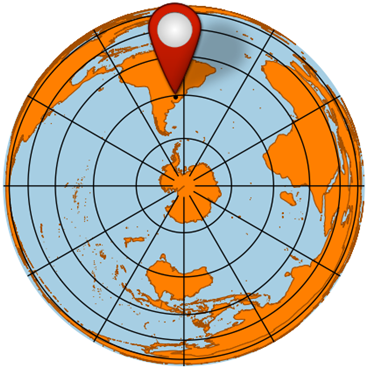
I prepared a simple tutorial for you about how to make an Azimuthal map of the South Pole. This type of map is like a view of the globe from south. The United Nations symbol is an azimuthal view of the world, but from the North pole. Azimuthal maps are certainly more common in the northern hemisphere, but they can be done for the southern hemisphere as well. They can be useful for localizing places in Antarctica, South America, Africa, and Oceania. These maps can be included in scientific publications or presentations. Last week I presented my research in the EGU General Assembly 2021 and part of the location map was prepared in South Pole azimuthal projection. These steps shown below are the basics of how to make an azimuthal map for South Pole. You can enhance this map with many other plugins, base maps, downloaded graticules, etc.
To build this map, we will need:
Shapefiles of the Earth’s continents. You can find those at many places on the internet, here I am using Countries 1:10m by Natural Earth (https://www.naturalearthdata.com/downloads/10m-cultural-vectors/10m-admin-0-countries/) which is Public Domain.
QGIS. I am using QGIS 3.18 Zürich.
The coordinates of your location in latitude and longitude. I chose the point -30.883827, -55.542559, a randomized point in the municipality of Santana do Livramento, Rio Grande do Sul, Brazil.
First, we should prepare the data
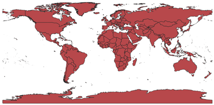
When opening the countries shapefile, the countries divisions are apparent.
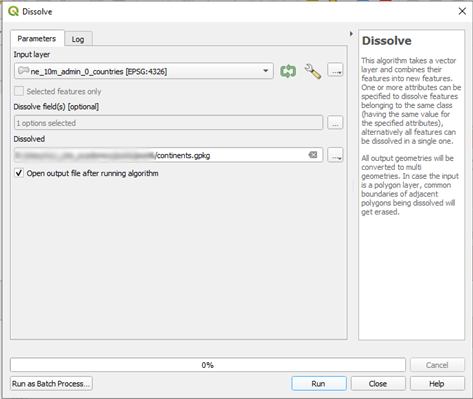
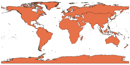
To eliminate this division, we can dissolve the countries’ borders. I am dissolving this shapefile by the field REGION_UN.
Getting this shapefile:
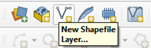
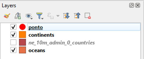
Add the point as a shapefile
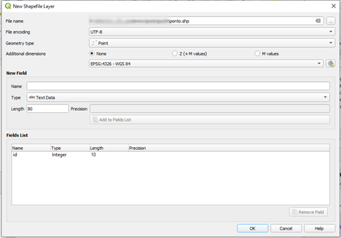
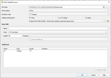
First, create a new Shapefile Layer
Choose the geometry type as Point. Choose the World Coordinate System in which your coordinates are given. For reference, points from Google Maps are on WGS 84, but the official DATUM of Brazil is SIRGAS 2000, so pick the right WCS based on your data source.
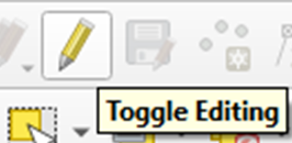
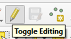
Start editing the feature.
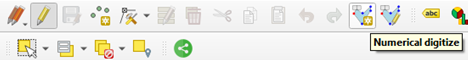
Add the point by coordinates using Numerical digitize.
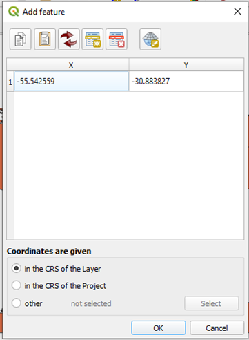
Write the coordinates of your point. Select the option to provide them in the CRS of the layer.
Write an integer number as the point id.
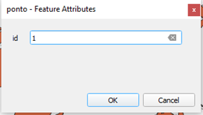
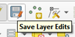
Save your edits.
Stop editing the shapefile.
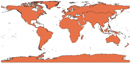
You should see your point plotted on the map:
Reproject the data
Click this button on the lower right to alter the projection in which the layers are shown. No need to change the actual layers projections.
Filter the projections by “South Pole” to see which options are available.
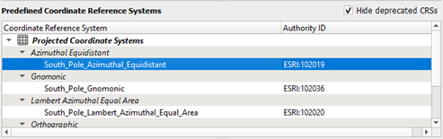
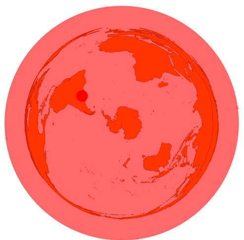
South Pole Azimuthal Equidistant (ESRI: 102019) produces a map like this:
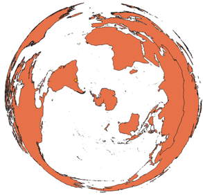
Which distorts U. S. A. and Russia considerably.
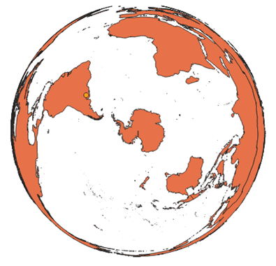
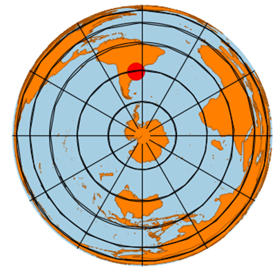
I prefer Lambert Azimuthal Equal Area (ESRI: 102020):
Adjust the style of the layers
These colors are not the best to highlight our location.
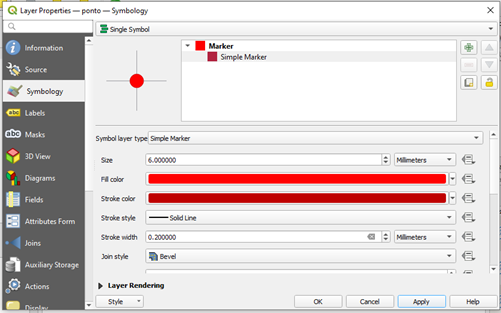
Edit the point symbology to change its color and size.
Among many options, you can add a svg or a custom geometry as your marker, but I suggest using a simple marker type, for the map to be more minimalist and easy to interpret. However, if this map is going to appear in a large page, you can explore the other options as long as it is not too much information to the reader.
I chose this style for the marker:
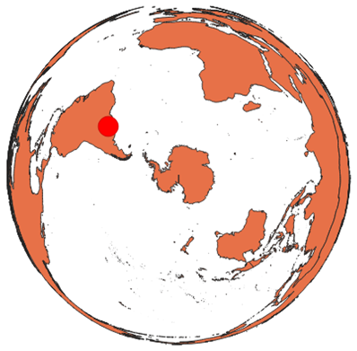
At this point, the map looks like this:
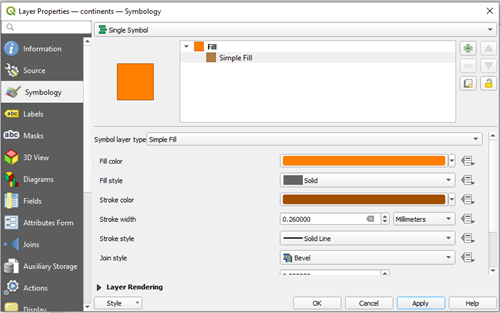
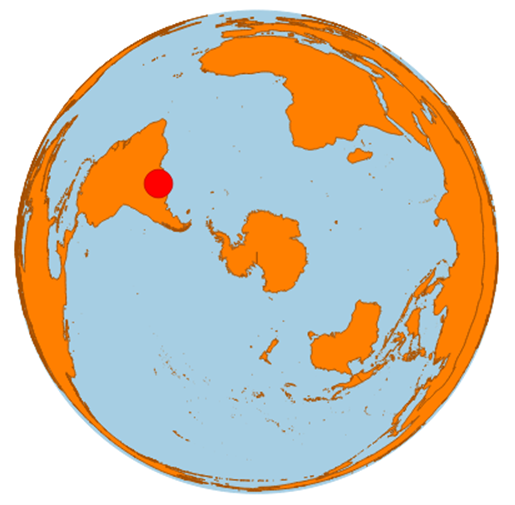
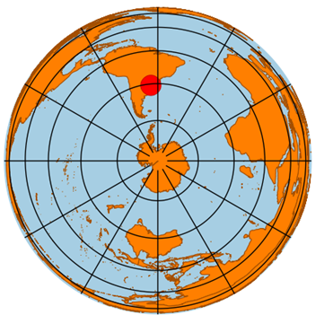
Alter the style of the continents. I suggest a tone of orange:
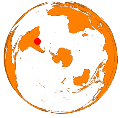
Now the map is looking like this:
Draw the oceans
Something is missing. We are used to seeing these maps with the blue oceans as background.
The easiest way to do this is to draw a circle and choose a blue symbology for it.
Create a New Shapefile Layer, but this time, choose the Polygon type.
Start editing the feature.
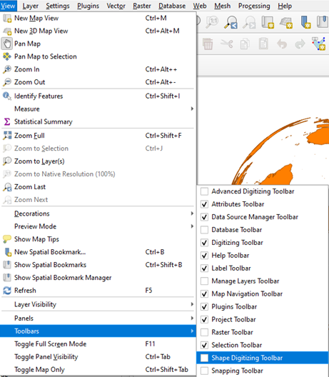
To activate the possibility to draw a circle from the center and a point, activate the Shape Digitizing Toolbar on View, Toolbars.
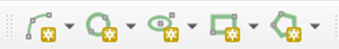
You should see this toolbar:
Click in Add Circle by a Center Point and Another Point
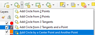
Click on the center of the map, coordinates 0,0 (if needed, zoom with the mouse scroll) and then right-click on one of the borders of the map.
Save the changes in the layer and Toggle editing.
The circle will be over your map, but just rearrange the order of the layers so that it stays behind:
Change the ocean’s color. I like light grayish blue. At this point, your map should look like this:
(optional) Add satellite imagery as background
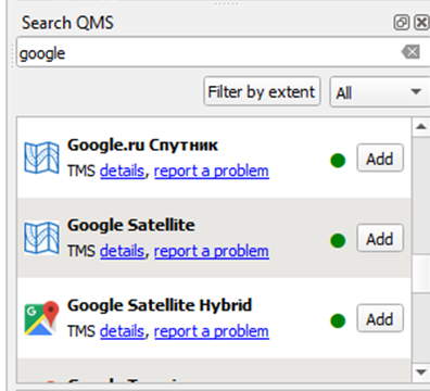
If you want, you can use the plugin Quick Map Services to add a satellite image to the background. First, install the plugin on the QGIS Plugin Manager, at Plugins, Manage and Install Plugins. After installation, a panel should appear on the right. Choose the satellite imagery that you want and click Add but remember to check the terms of use. Here, I chose Google Satellite:
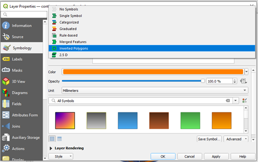
On the Layers panel, move your layer to just above the oceans one. In the symbology of the Continents layer, change the symbology to Inverted Polygons. Choose the white as the fill color and put a transparency level of about 50%.
You should see something like this:
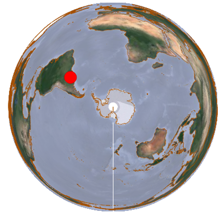
(map made with QGIS, data from Google Satellite and Natural Earth) (attribution is required when using Google Satellite)
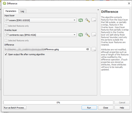
If you want a homogeneous color in the oceans, you should subtract the continents from the circle you drawn before, and choose the adequate symbology for the resulting layer.
Resulting:
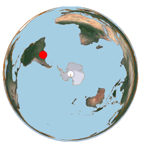
(map made with QGIS, data from Google Satellite and Natural Earth)
Build your map on layout
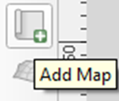
Create a new print layout on the menu or pressing Ctrl + P. Add your map.
Add a graticule
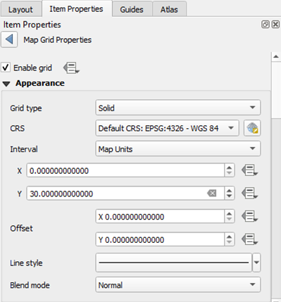
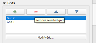
On Grids, add a new grid
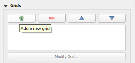
And then click Modify Grid
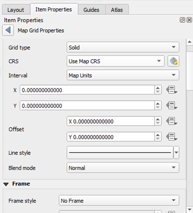
On the CRS, choose the CRS of your data, unless your data is projected. If it is on a projected CRS, choose the equivalent geographical coordinate system. I am using EPSG 4326.
In this tutorial, we are going to use different representations for X and Y grids, due to the rendering of Y grid lines on QGIS Layout. What happens is that QGIS draws straight lines from one X graticule to the next one, and one can see a discontinuity in X=0. To avoid that, I draw X and Y separately.
The intervals should be chosen depending on the final size of the map. I chose 30 degrees for both X and Y, and an offset of 10 for the X to avoid the discontinuity of the lines on 0 degrees.
I set Grid 1 as:
Obtaining:
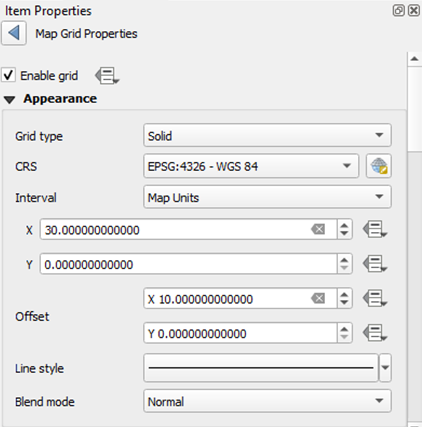
And I set a separate Grid 2 as:
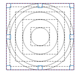
But the grid appears to be drawn with many small straight lines instead of circles, and it has a discontinuity on X=0. This bothers me, so I draw circles above these graticule lines, and delete the graticule lines later.
Draw the first circle and adjust over the graticule line.
You can draw in whatever style or color you like, but after it is done, you should alter the style to a transparent fill, and black stroke.
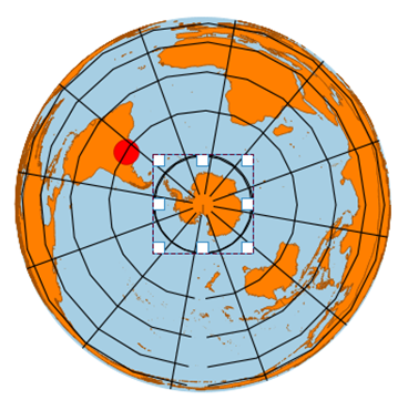
After you have drawn all the graticules, you can go to Grid 2 and Uncheck “Enable Grid”. Don’t delete it just yet.
Go to the items and uncheck Map 1.
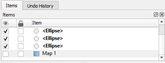
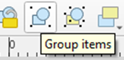
Select the graticules you just drew and group them. This will be useful later.
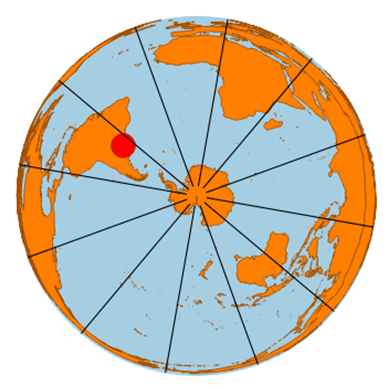
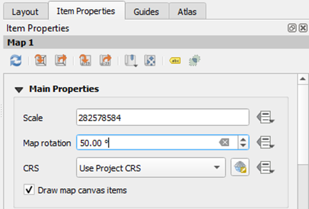
Rotate the visualization of the map to highlight the location of your point
Start rotating the map and choose a rotation that puts your point in evidence.
Uh-oh, now the graticule if off-centered.
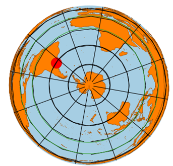
Turn the Grid 2 back on and drag your graticule group until it is aligned once again.
You can safely delete Grid 2 now if you want.
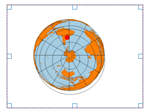
Our map looks like this:
Great!
Add attributions and legend (if needed)
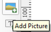
The Add Picture button allows for you add the “Made on QGIS” image on your map. Attribution to QGIS directly on the map is not needed, though appreciated.
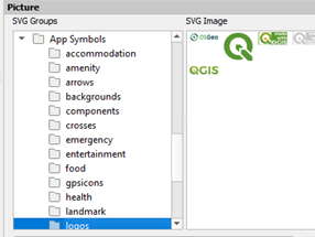
Find the svgs in App Symbols, logos:
Check the data sources from which you downloaded your data, and the satellite imagery (if any) to find out about their attribution policies.
Extras:
- How do I add a marker that looks “3D” outside the graticule, for my point?
In your base map, alter the point style to a much smaller marker, but that you can still see in the layout. Then add the preferred svg on the Print Layout using Add Picture.
I added the red marker svg symbol from QGIS.
- What if I want to highlight a country, not a point?
On the original shapefile, the countries were separated. You can use the Attribute Table to find and select the desired country polygons, export to another shapefile, then use this new shapefile just over the continents one, on the Layers panel. Alter the symbology to highlight the country accordingly.
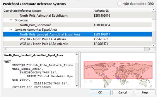
- I would like to do the same type of map, but on the North Pole.
Just choose the equivalent CRS ESRI: 102017 “North Pole Lambert Azimuthal Equal Area”.
Luísa Vieira Lucchese
Research Assistant Professor
Research Assistant Professor at University of Pittsburgh